
Beyond the Phone App: Rethinking Defaults in Digital Product Design
Why every solution doesn’t need to be a mobile app and what we're missing when we pretend it does.

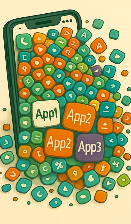
The Answer Isn’t Always an App!
As a UX designer who primarily works on digital tools, I’ve often found myself in a bubble where every solution seems to be a mobile app. Given the digital reach we have today, it makes sense, apps are an easy and scalable way to distribute tools and information. But lately, I’ve been reflecting on how limiting that mindset can be.
Recently, I joined a Product Management course to upskill and broaden my perspective. Most of my cohort is based in India and already working in the PM field. We have weekly mentor sessions where we collaboratively brainstorm solutions to different challenge statements. It’s been incredibly insightful to see how others think especially those coming from sectors outside my usual UX circle.
But I began noticing a pattern: no matter the problem, the solution was almost always an app. A shiny, all-in-one app that promises to solve everything. A sort of digital magic wand. And while I love good design and intuitive tools, the reality is that most of us already use a handful of different apps for just one part of our lives. Take finances, for example: I use my banking app, Rocket Money (because their UI just works better for some things), Venmo or PayPal because not everyone uses Zelle, and even my notes app and calculator because bill splitting somehow always gets messy.
One of my goals with this course was to learn how PMs in different contexts approach problems. But even in a cohort of nearly 300 people, the default solution was still just another app.
No hate to the craft that pays my bills, but it’s honestly a little amusing and also worrying. In markets where phones are often the only, or first, computing device people have access to, it makes sense that mobile-first thinking dominates. But that doesn’t mean every problem should be answered with another quick commerce app in the name of innovation.
Part of this pattern, I suspect, comes from how product thinking is taught. Whether it’s case competitions, startup pitches, or hackathons, there’s often an implicit expectation that the solution be digital and more specifically, app-based. It's efficient, it’s demo-able, it looks good in a portfolio. But the more we treat apps as the starting point rather than one of many possible endpoints, the more we narrow the scope of what’s considered a valid solution. If we framed problems differently around behavior change, policy nudges, or even analog interventions, would our solutions still look the same?
This hit home again during a casual group chat conversation where folks spent a good ten minutes comparing the price of milk on Blinkit, Zepto, and BigBasket. These are professionals who live in well-developed housing societies many of which have grocery stores inside the complex. Still, the first instinct isn’t to walk downstairs, but to open three apps and cross-reference milk rates like they’re comparing flight tickets.
I couldn’t help but think back to when BigBasket actually had a distinct identity. It wasn’t always racing to be the fastest. It was marketed as the place to find premium, hard-to-get items, a sort of urban pantry for indulgent cooking. Their brand ambassador was Shah Rukh Khan, who talked about ordering his favorite things. That version of BigBasket had a point of view. Now? Same UI as the others, same 5-minute delivery promise, and a homepage carousel that looks like it was copy-pasted from Zepto.
It’s not that these services aren’t useful, they absolutely are. But when every app starts to look the same, act the same, and serve the same function, we have to ask: what are we actually innovating? Faster isn’t always better if it comes at the cost of creativity, sustainability, or even user need.
And this becomes even more relevant when you consider where these products are often being built. A huge chunk of global product development, especially for tools created by Western companies, is happening in India. We’re building everything from enterprise dashboards to GenAI-powered integrations and next-gen collaboration platforms. We see the rise of wearables, voice assistants, and screen-less interfaces in those tools, yet when it comes to our local problems, the instinct still seems to be: make an app. Preferably with dark mode and 5-minute delivery.
We also forget that people aren’t just “users” of phones, they’re cooks, students, caregivers, drivers, runners, prayer group members. Their contexts are rich and layered. Designing something meaningful often means stepping away from the screen and into the environments they actually live in. And yet, even when we talk about “user journeys,” we confine that journey to swipes and taps, missing all the messiness that happens offscreen.
We’ve got some of the brightest minds and most diverse user contexts to build for, but are we challenging ourselves enough? Are we thinking beyond the phone screen? Beyond user flows that end in checkout carts and push notifications?
Because sometimes the best solution isn’t an app.
Sometimes, the real challenge is letting go of the idea that innovation has to fit in your pocket.
And maybe, just maybe, we need to ask:
Is another screen the most meaningful thing we can offer? Or is it just the easiest one to ship?